


nickchapmanstudio2020-11-24T10:55:48+00:00
Corporate Identity For Stadtkind Nick Chapman Studio was approached by a coffee shop/bar based in Berlin to design it’s branding. The name Stadtkind loosely means ‘child of the city’ The brief was to come up with a simple logo to invoke the chilled out playful nature if this brand. This lavish urban 21st century bar is furnished with [...]

nickchapmanstudio2020-11-23T11:00:01+00:00
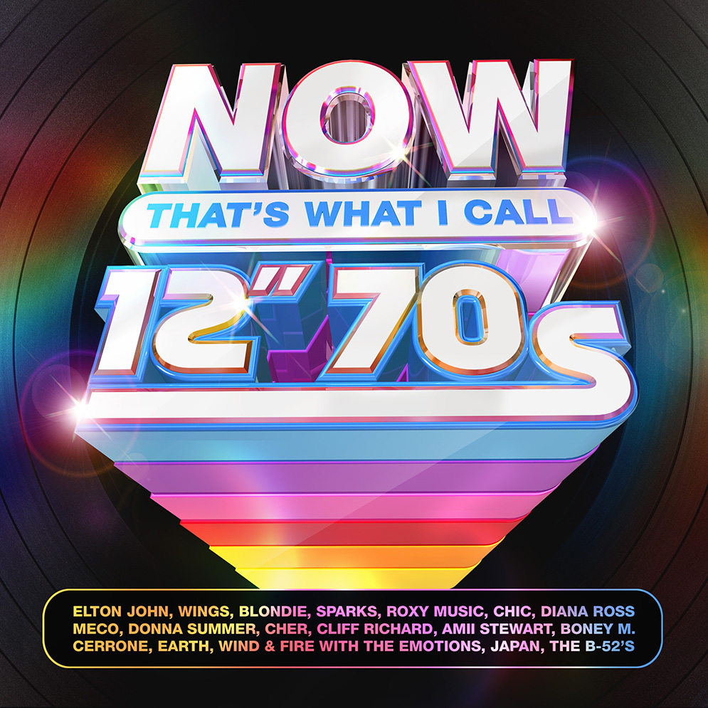
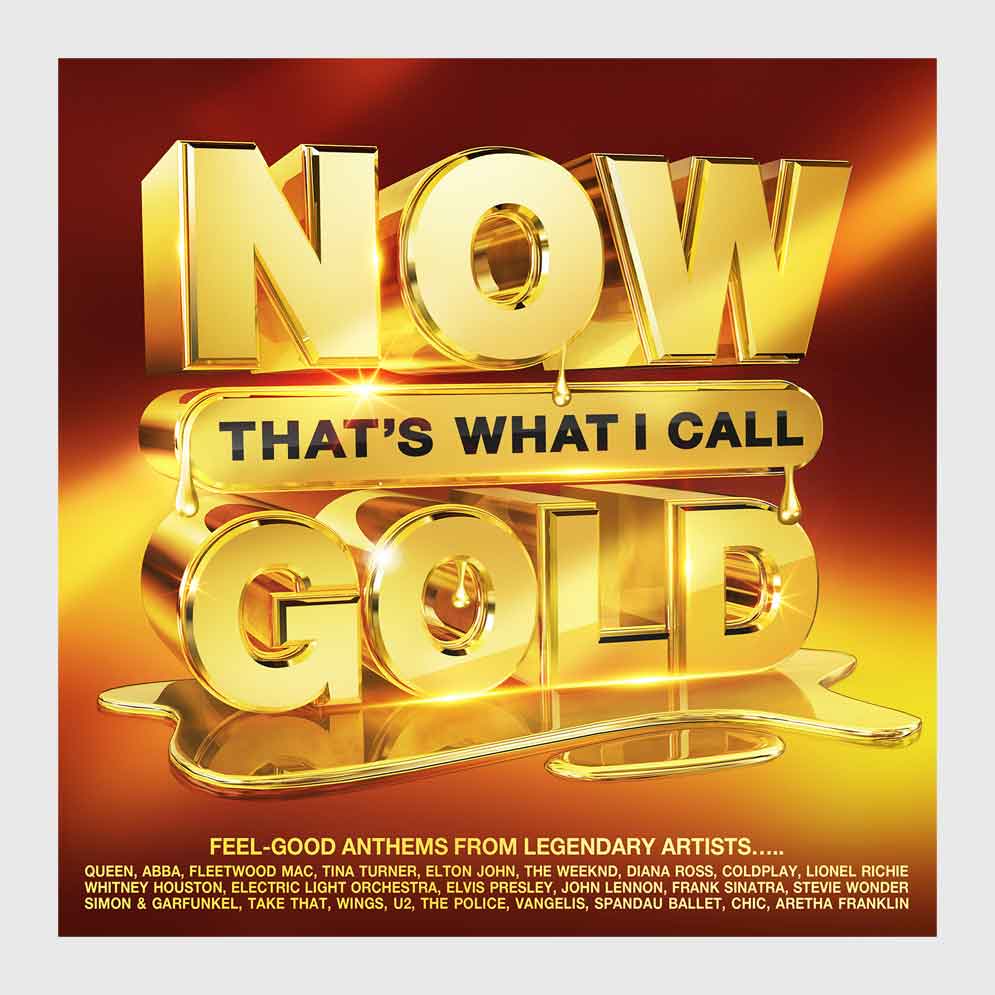
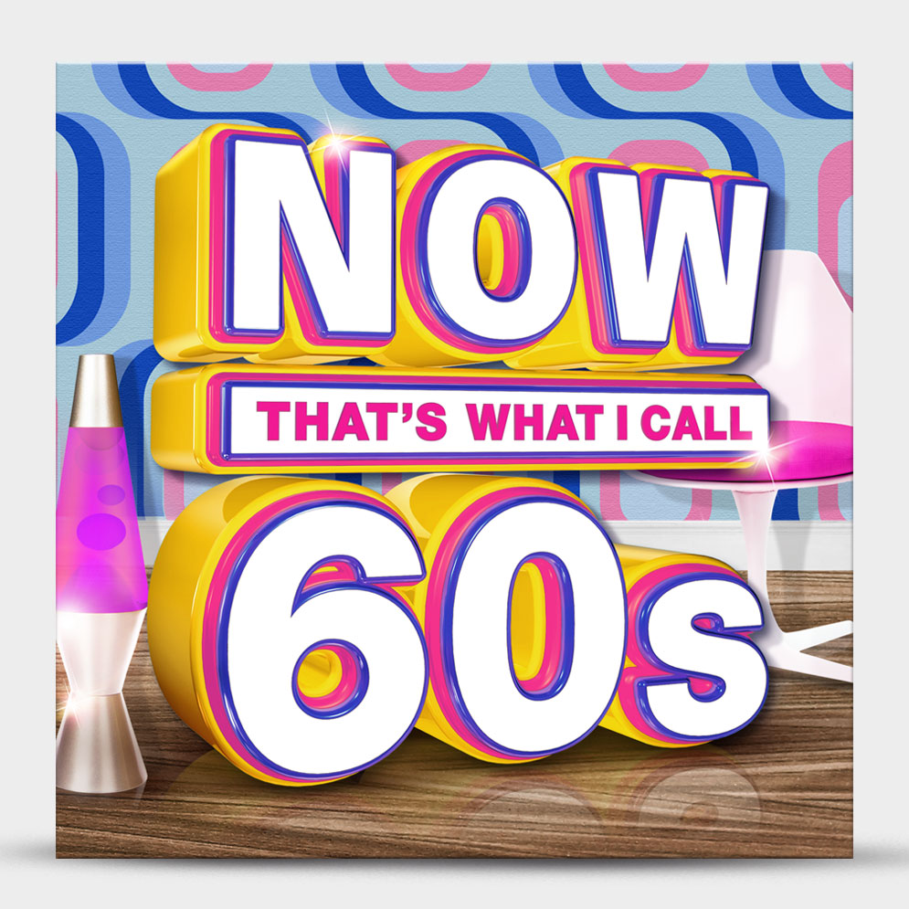
Record sleeve design for Sony Music The Brand Now That’s What I Call Music saw it’s first release in 1983. The concept was taken from a 1920s advertising poster for Danish bacon featuring a pig saying "Now. That's What I Call Music" as it listened to a chicken singing, which was hung on a wall in Simon Drapers [...]
nickchapmanstudio2020-10-09T11:40:23+01:00
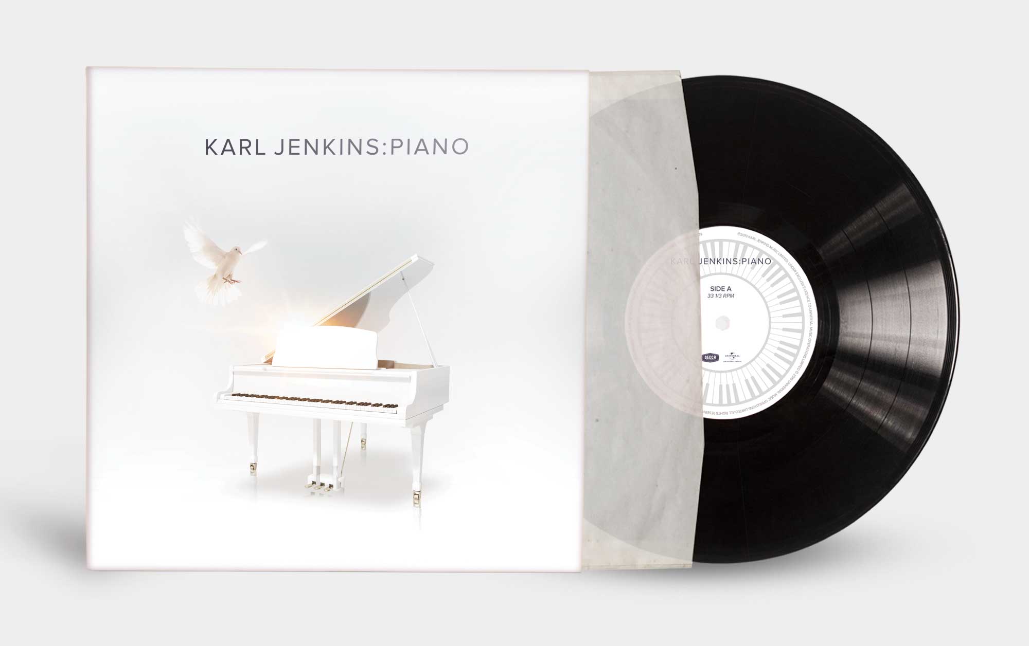
Karl Jenkins: Piano Karl Jenkins is the UK's most popular contemporary composer, and one of Wales' most versatile and critically-acclaimed musicians. He is perhaps best-known today for the Adiemus project. The 1994 album Adiemus: Songs Of Sanctuary, described by Jenkins as "an extended choral-type work based on the European classical tradition, but where the vocal sound is more [...]
nickchapmanstudio2021-10-04T15:08:39+01:00
Record sleeve design for Sony Music The Brand Now That’s What I Call Music saw it’s first release in 1983. The concept was taken from a 1920s advertising poster for Danish bacon featuring a pig saying "Now. That's What I Call Music" as it listened to a chicken singing, which was hung on a wall in Simon Drapers [...]

nickchapmanstudio2020-11-20T11:30:09+00:00
Karl Jenkins: Adiemus - Songs Of Sanctuary Karl Jenkins is the UK's most popular contemporary composer, and one of Wales' most versatile and critically-acclaimed musicians. He is perhaps best-known today for the Adiemus project. The 1994 album Adiemus: Songs Of Sanctuary, described by Jenkins as "an extended choral-type work based on the European classical tradition, but where [...]
nickchapmanstudio2020-11-20T11:40:22+00:00
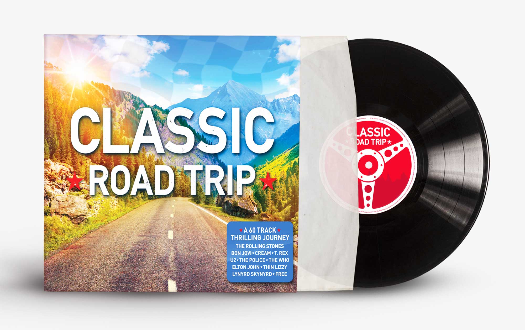
CLASSIC ROAD TRIP is a thrilling, 60 track journey through iconic, classic rock - the perfect soundtrack for any road trip, the sound of the open road. We were briefed by Able Media along with U.M.O.D to come up with a sequel to American Road Trip, which would work across the TV advert and all the the packaging. [...]
nickchapmanstudio2024-02-21T16:57:25+00:00
Corporate Identity At Nick Chapman Studio we pride ourselves on crafting strong identities and building brands that have great longevity. Our logos spread across a broad spectrum of sectors, from Bands and bars right the way through to corporate organisations. A clearly defined and positive corporate identity is of vital importance for success and growth of any [...]

nickchapmanstudio2020-11-20T11:49:41+00:00
The Rock Album is the ultimate rock-a-long album for all those rock lovers. We were briefed by Able Media along with U.M.O.D to come up with an authentic & hard hitting feel to this rock album. We developed an anthemic looking sleeve which would work across the TV advert and all the the packaging. This 3CD album consists [...]
nickchapmanstudio2020-11-20T16:39:59+00:00
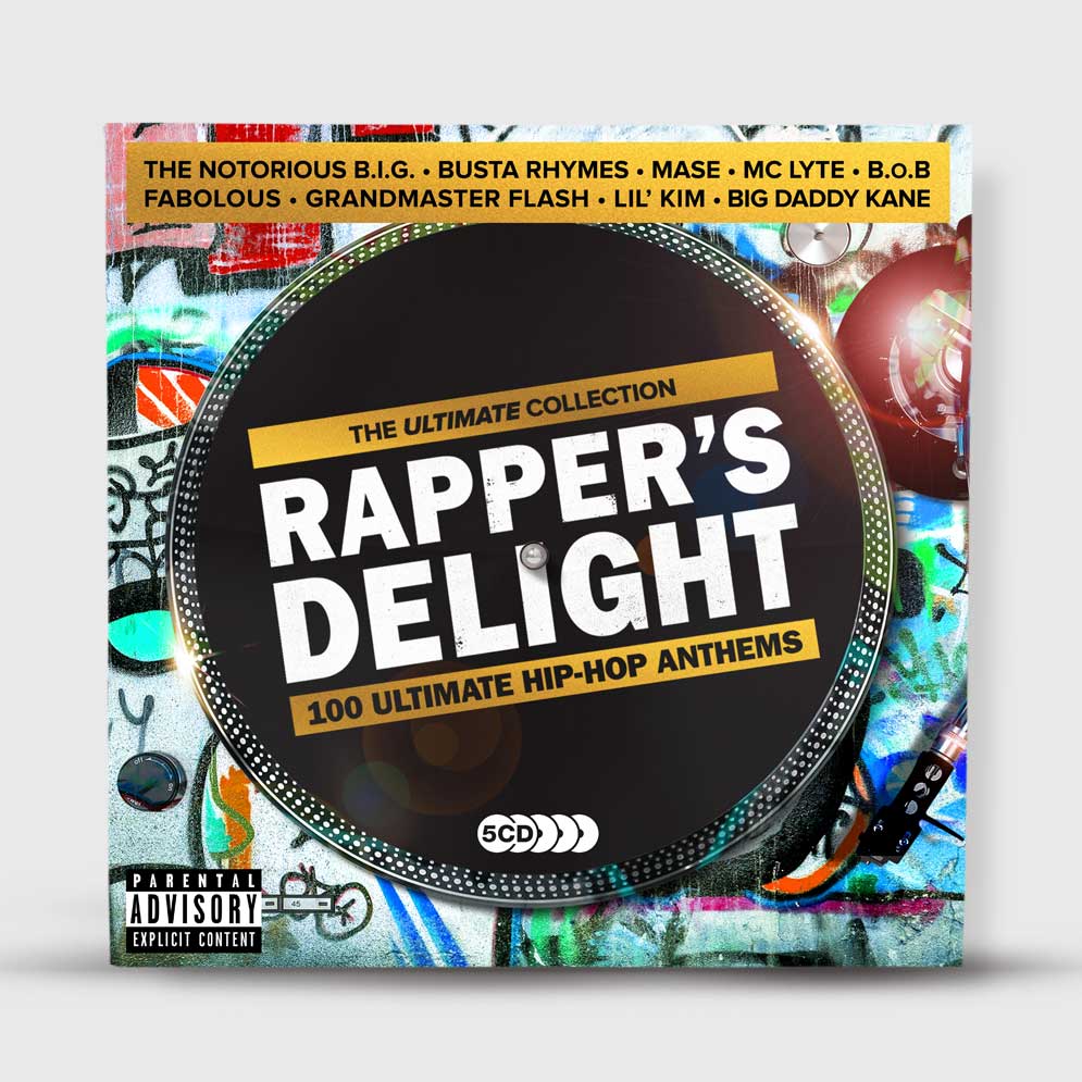
The Ultimate Collection is the best-selling 5CD range from Union Square Music. Each album features 100 tracks, showcasing the finest major-label repertoire and the biggest artists of any given genre. Nick Chapman Studio was approached by Union Square Music to completely revamp the series, with brand new contemporary designs created to really stand out in the racks, and [...]
nickchapmanstudio2020-11-23T10:37:11+00:00
Record sleeve design for Sony Music The Brand Now That’s What I Call Music saw it’s first release in 1983. The concept was taken from a 1920s advertising poster for Danish bacon featuring a pig saying "Now. That's What I Call Music" as it listened to a chicken singing, which was hung on a wall in Simon Drapers [...]

nickchapmanstudio2020-11-20T12:24:23+00:00
Record Vinyl Sleeve design for Z Records. The artwork brief was to come up with a surreal ethereal feel. Full Fronteira' is the debut album under the Nova Fronteira guise from Keyboard Maestro Michele Chiavarini, probably better well known to Soulful/Disco House lovers as long-term collaborator with a certain Mr. Dave Lee AKA Joey Negro.
nickchapmanstudio2020-11-23T10:58:13+00:00
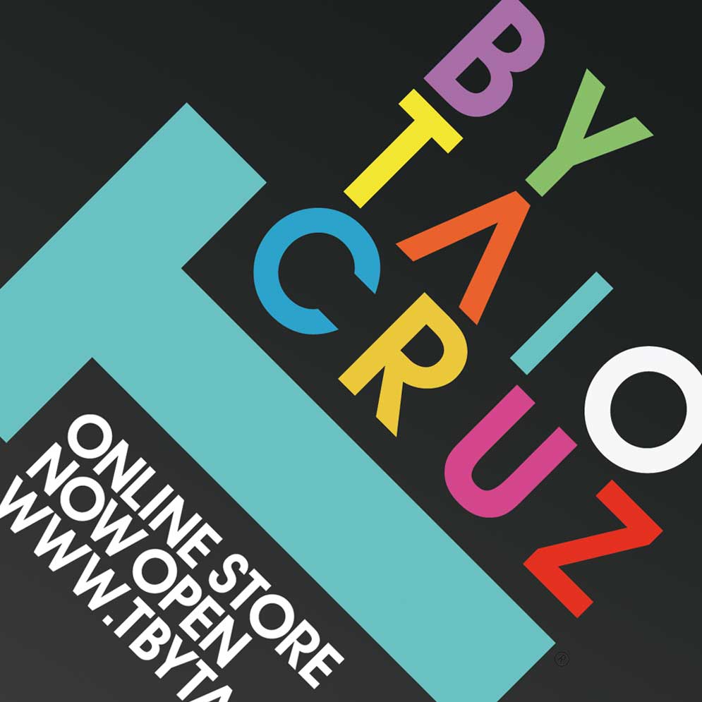
T by Taio Cruz T shirt and online shop branding We were approached by Taio Cruz to come up with a brand identity for a T shirt and merc range. We chose to keep it very graphic and quite simplistic with minimal contemporary typography.
nickchapmanstudio2020-11-23T12:20:25+00:00
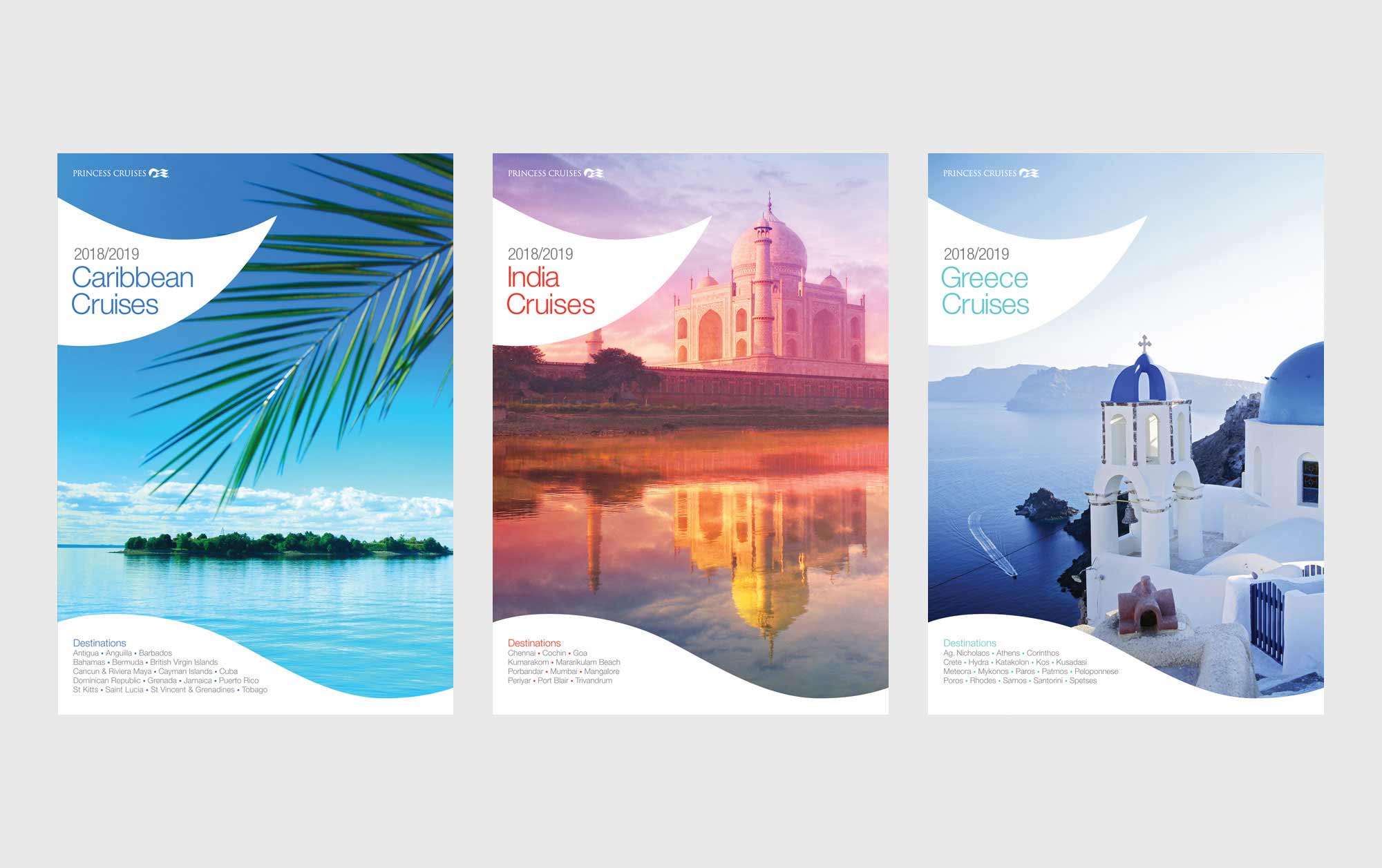
Princess Cruises Princess Cruises approach us to develop a range of destination brochures. The brief was to keep it very clean and slick - letting the destination images speak for themselves whilst still keep within brand guidelines.